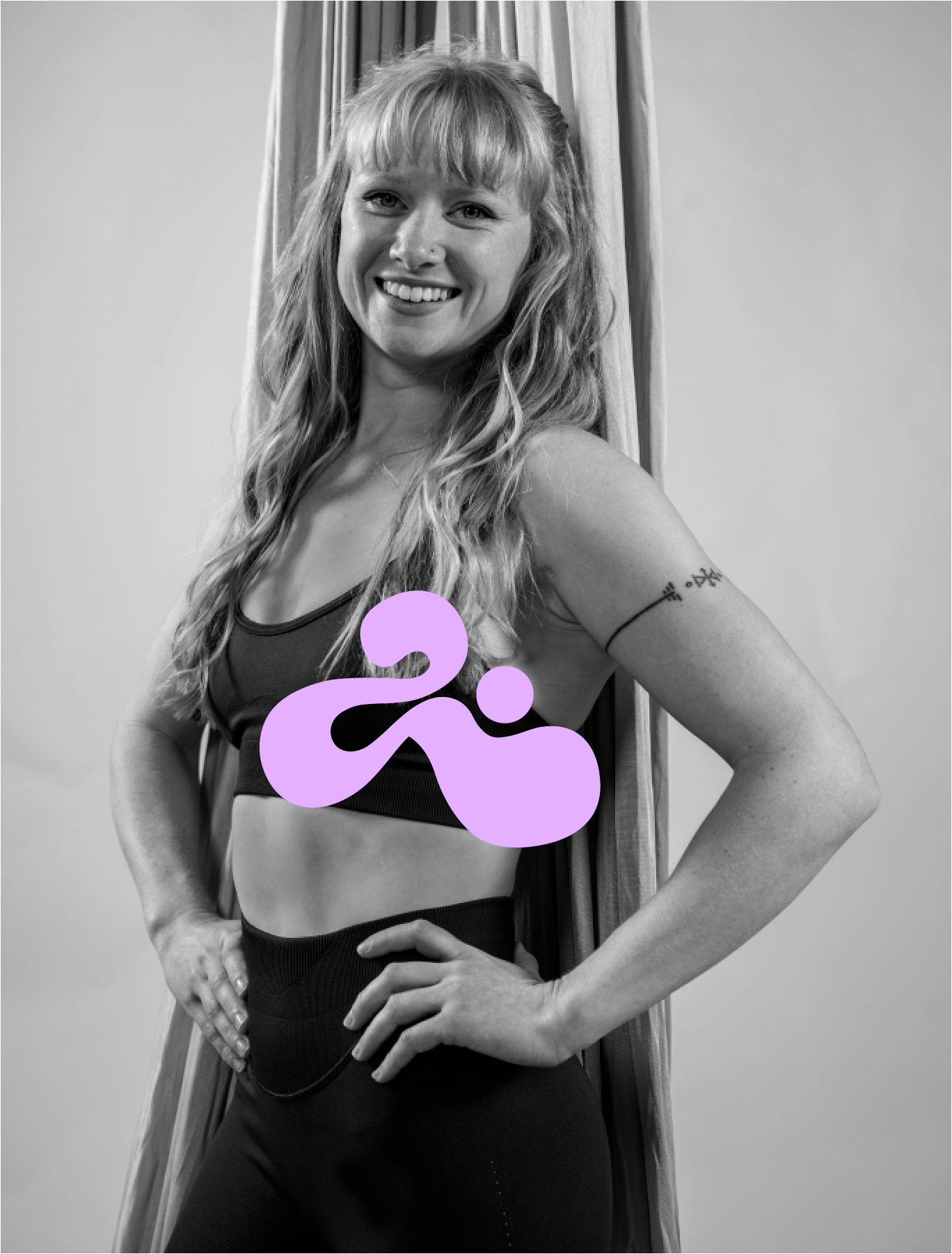
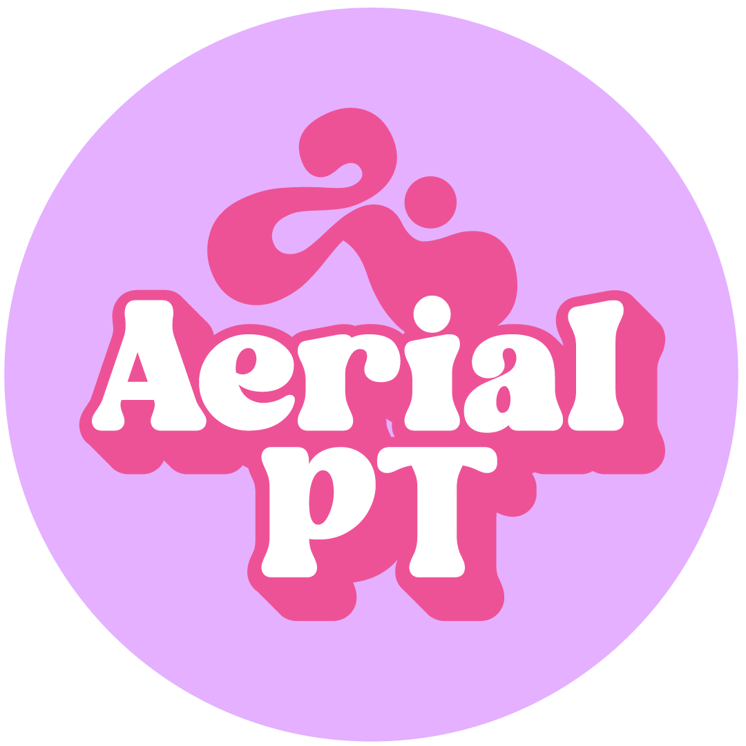
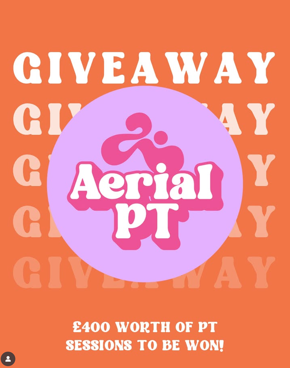
THE AERIAL PT
Phoebe who already runs a successful Aerial Circus business, added personal training to her belt and wanted a brand for it. She had an idea of the style she wanted - bold, bright, funky with a symbol. For the symbol I researched different body positions in training/stretching and the one we settled on was this abstract version of the cobra stretch. I supplied her with a brand guidebook including a primary logo, secondary logo, brandmark, fonts, colour palette, considerations and implementation.
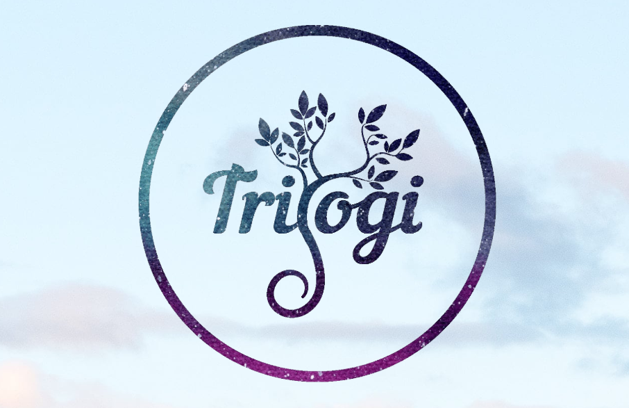
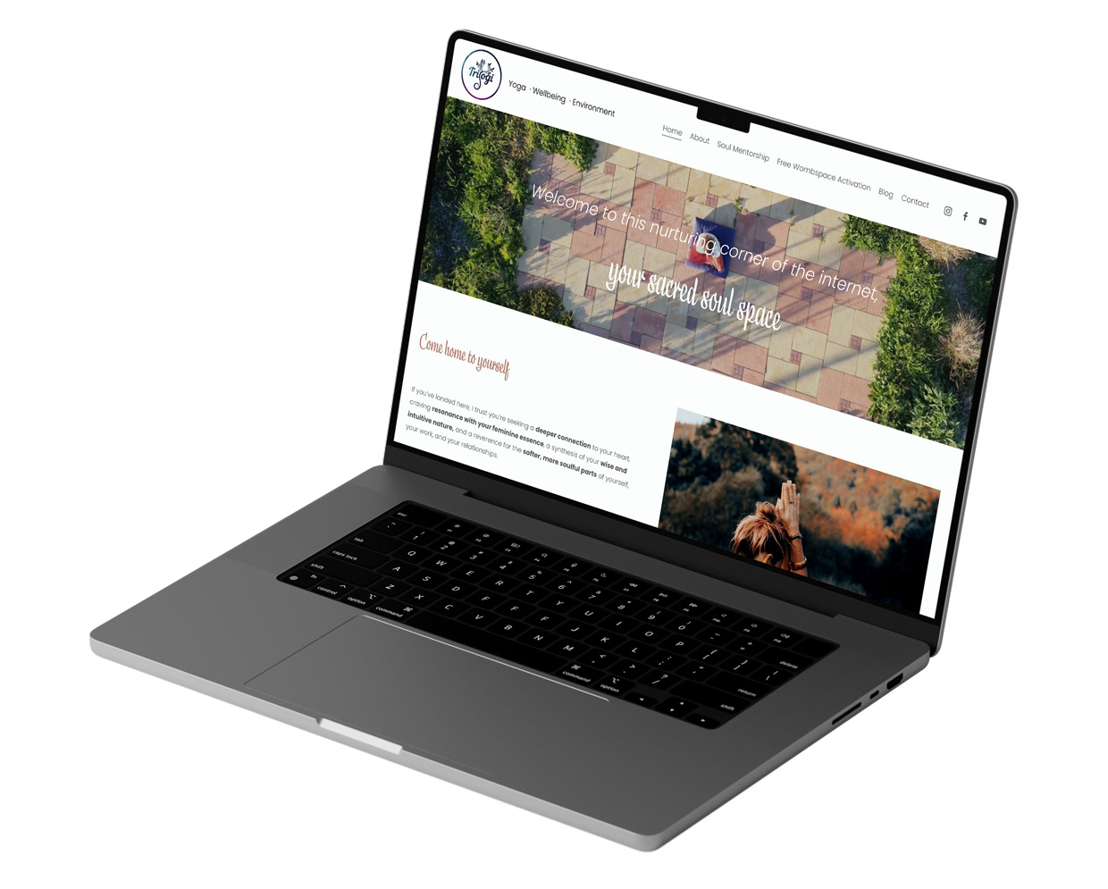
TRIYOGI
Triyogi is centered around wellbeing and the environment. I opted for a soft, clean brand which brought to life their ethos ‘Yoga that nourishes your roots’. Triyogi cares deeply about the environment and donates a percentage of profits to a charity that plants trees, I have incorporated this within the brand design.
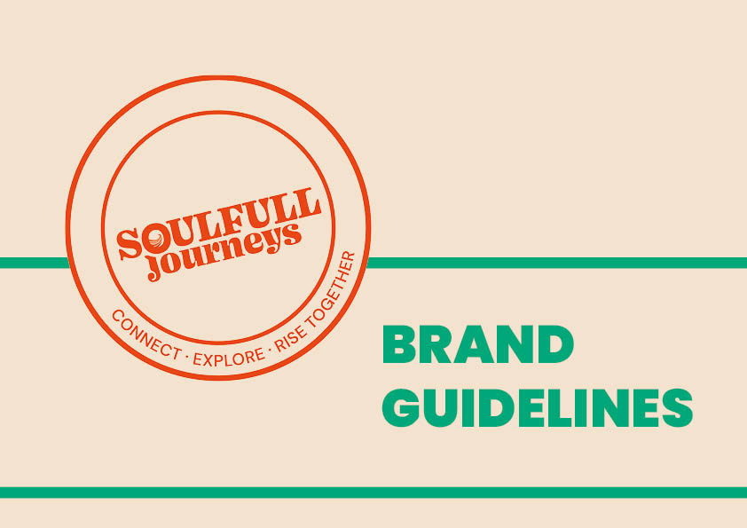
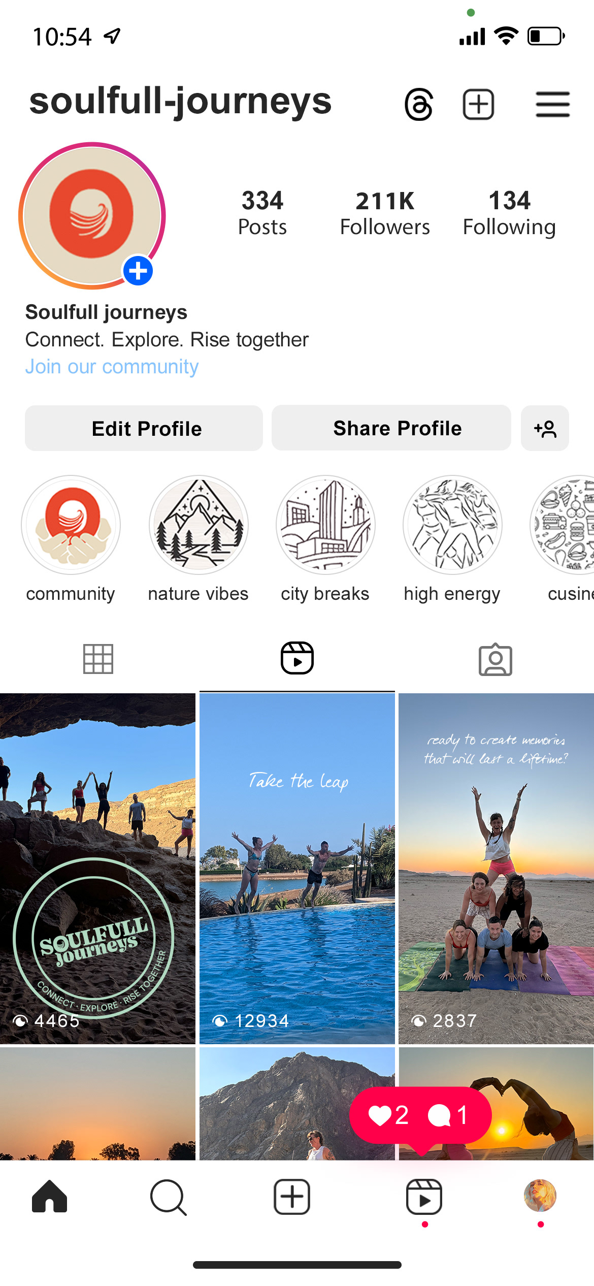
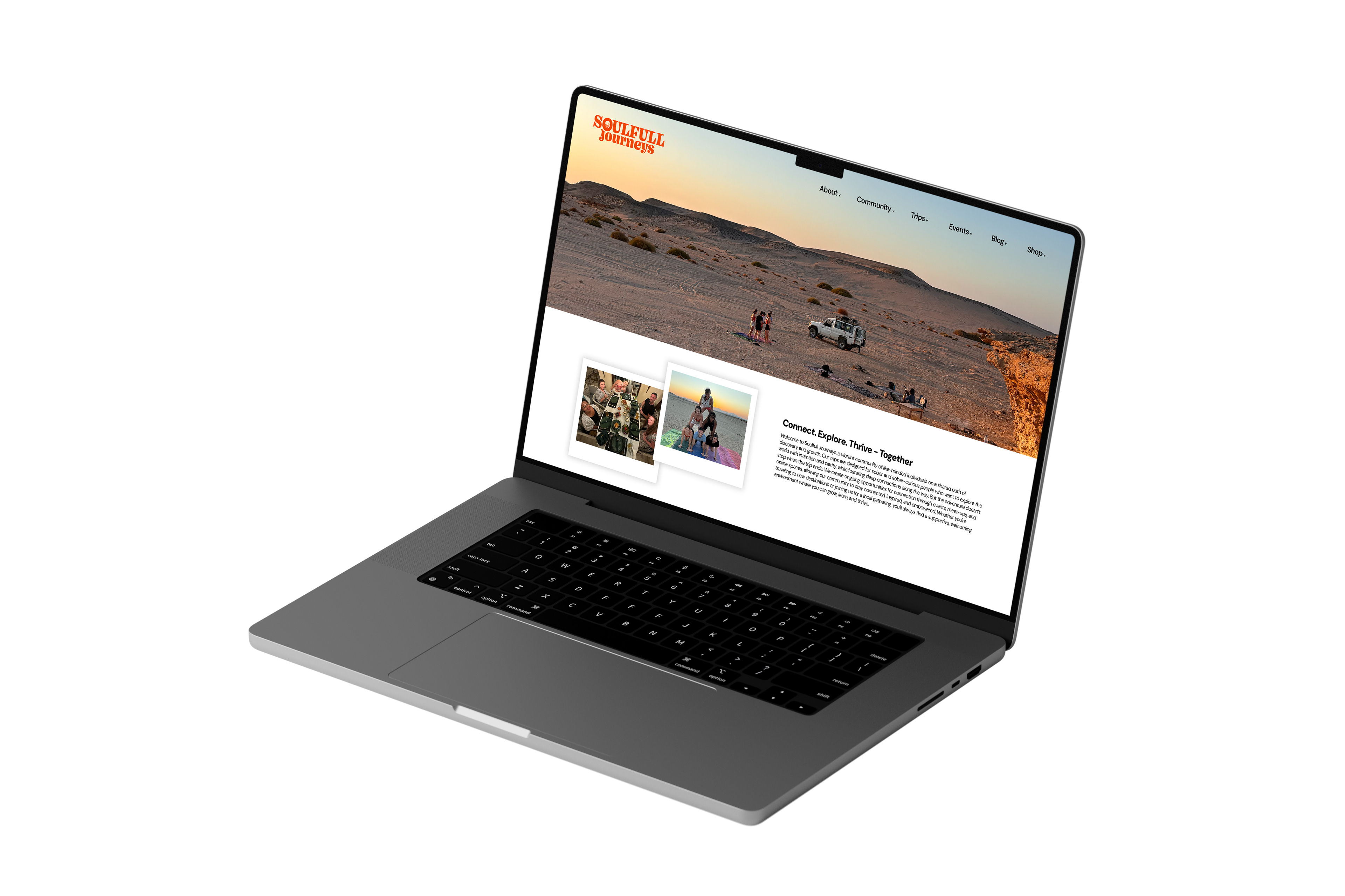
SOULFULL JOURNEYS
Soulfull Journeys is curated alcohol free and narcotic free vacations - focused on creating connections with fellow sober or sober curious - or those who just need a break without alcohol. The brand was created with the vision and values in mind. The 'O' has been accentuated as a circle, representing community, connection and the world. The primary logo represents a passport stamp to link with the travel aspect of the company.
The colour palette has been carefully selected to work visually together. The deep orange evokes feelings of warmth, kindness and joy. Green with a hint of blue has connotations with nature, growth and balance. While the beige has an earthy feel and relates to travel, whether it's the city, the beach or the desert. I supplied the company with a detailed brand guidebook including logos, fonts, colour palette, considerations and implementation.
wild flow retreats
A UK based retreat company that is aimed at giving women a place to decompress. We agreed on putting nature at the forefront of the brand. During my research I discovered Willow trees can symbolise healing, feminine energy and renewal which aligned with company perfectly!
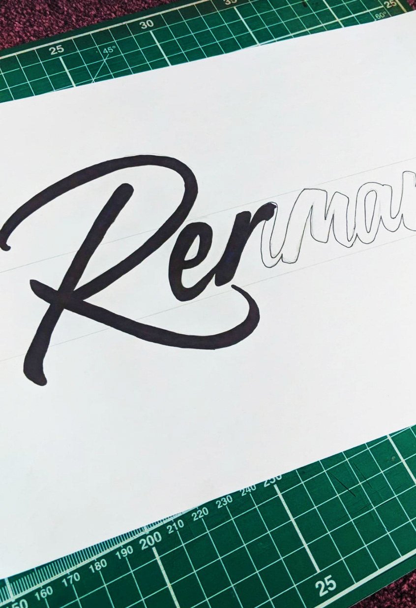
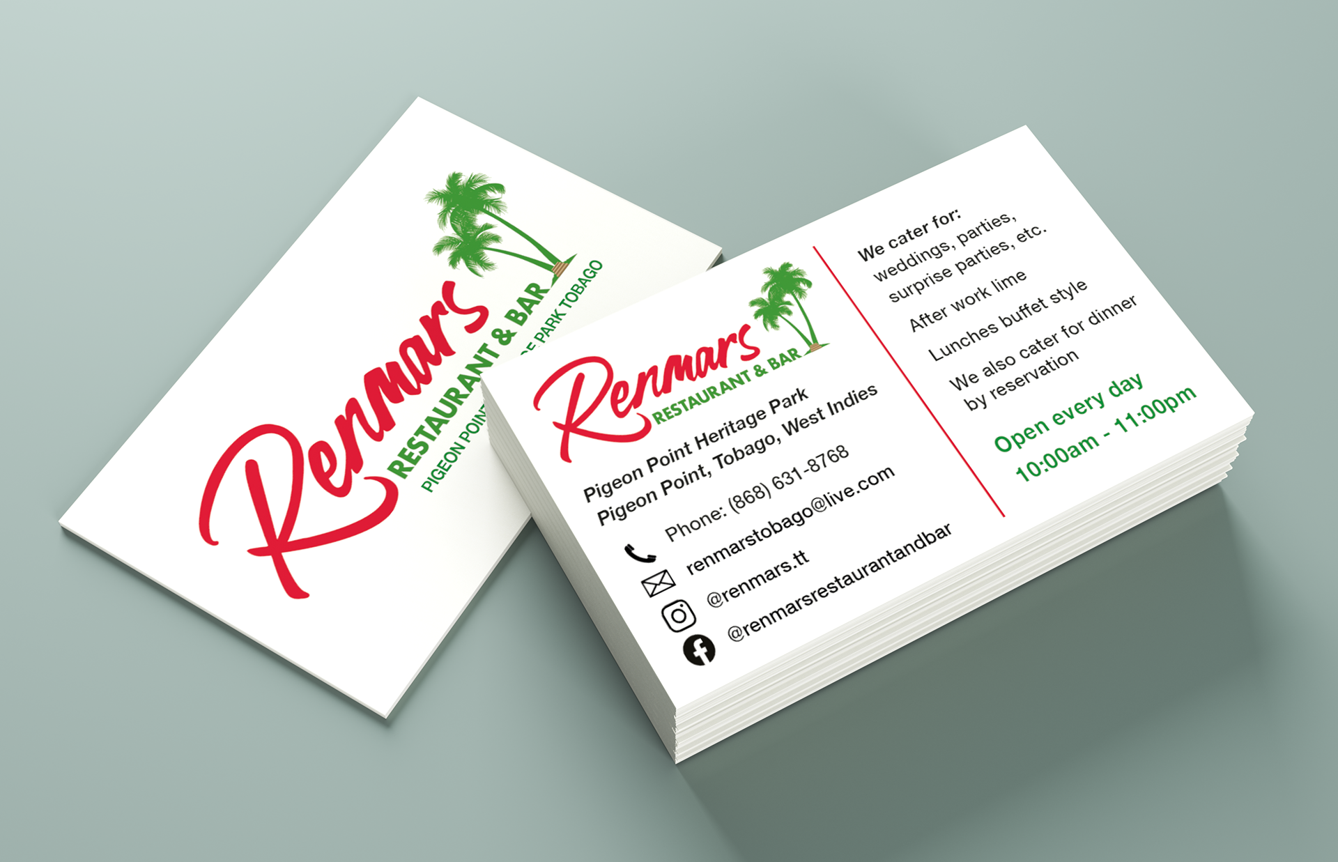
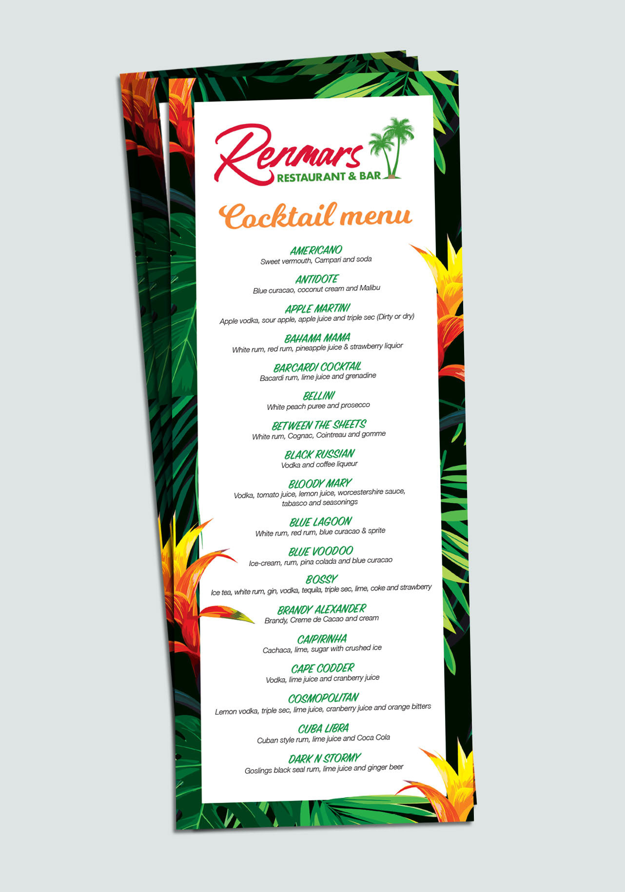
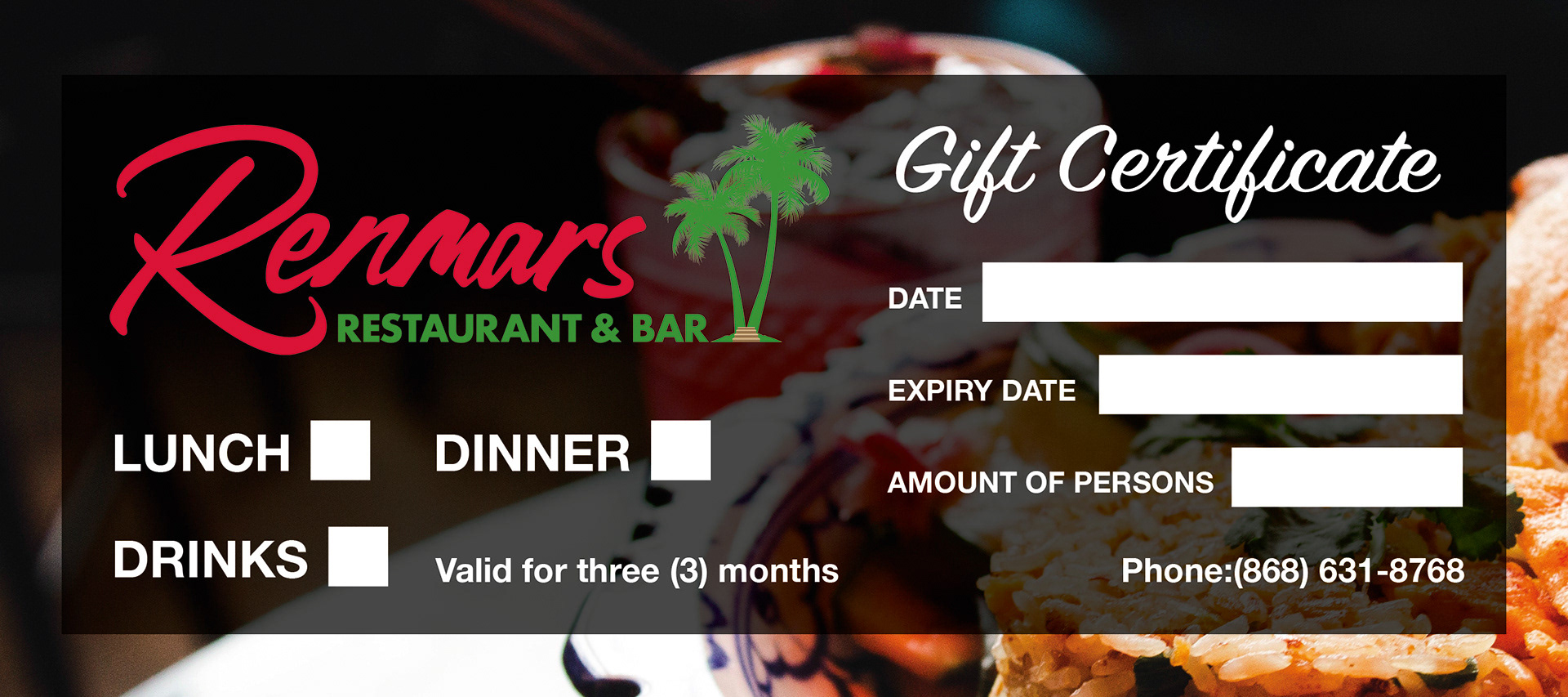
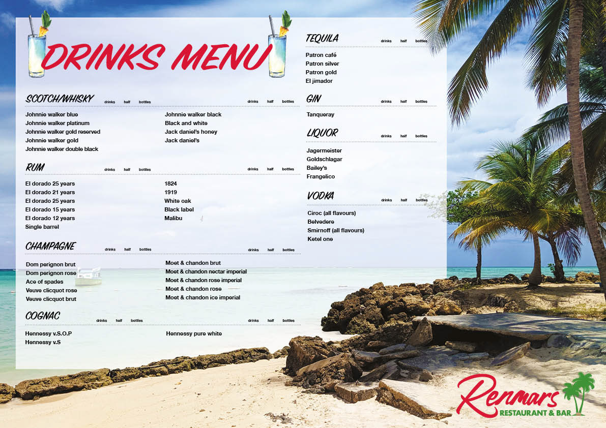
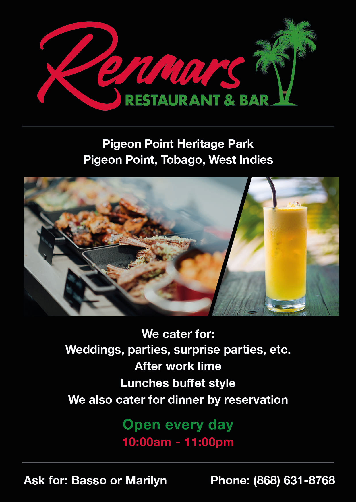
RENMARS CARIBBEAN RESTAURANT & BAR, TOBAGO
I visited this place a lot during my holiday in Tobago, on return to the UK I was asked to help rebrand their business to make it more modern and professional. I created an illustration of their iconic palm tree seat outside their restaurant and paired it with a personalised typeface. The rebrand included creating business cards, signs, menus and flyers. Hopefully I can go back one day and see it in it's full glory!